Form Elements
You should take the time to read this document thoroughly. These rules will help you fill in the blanks when you're both designing and implementing features. Once you're familiar with these high-level rules, visit the Pattern Library in Zeplin to learn more.1
Form Items
- Form labels: Use sentence case only. Long labels should wrap and shouldn't truncate.
- Required field labels: Mark required fields with a
*. If all fields in the form are mandatory, don't provide any indication.- In forms with left-align labels, align the asterisk to the right side of the label.
- In forms with top-aligned labels, align it to the left side of the label.
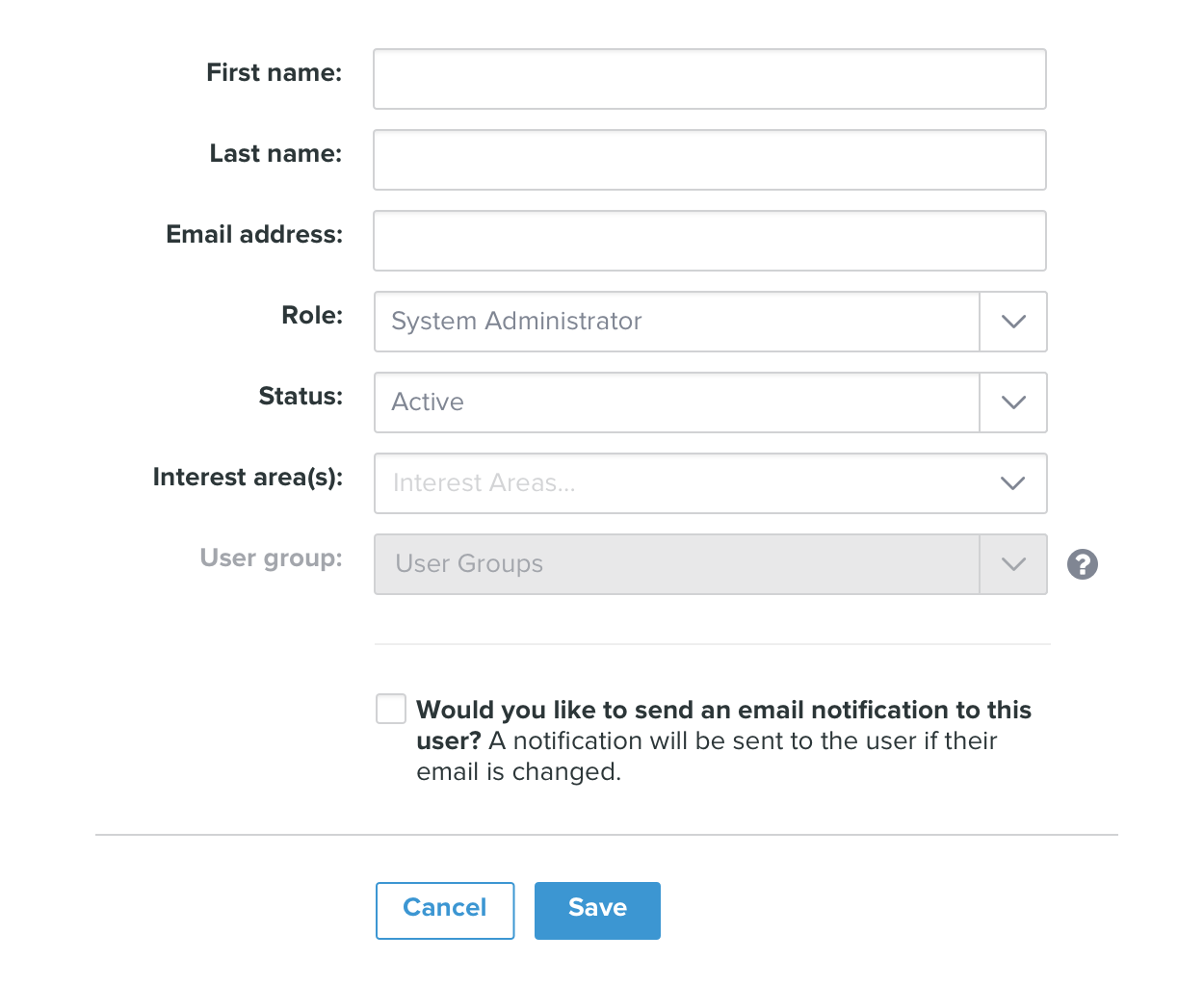
- Form fields: The length of the field should communicate the intended length of content. Available lengths are [TBD] and 100% width. These lengths also apply for other form controls of a similar shape, like drop-down menus and text boxes.
- Form fields order and visibility:
- If the form has a large amount of fields, group related fields and controls together.
- Use a divider to group a set of fields together. But be judicious, don't over use.
- If one field impacts another field, always place it before the field it impacts. When appropriate hide the child field until it's needed. e.g.: A drop-down asking about "Delivery Method" may show two options: Pick-up and Home Delivery. Selecting Pick-up doesn't need the person to specify any extra date information. But, Home Delivery needs a date, so choosing this option would reveal a child field.
- Disabled form fields: A form with disabled fields should style associated labels accordingly.
- Form help text: To assist users, you can add help text using an “info” icon and tool-tip.
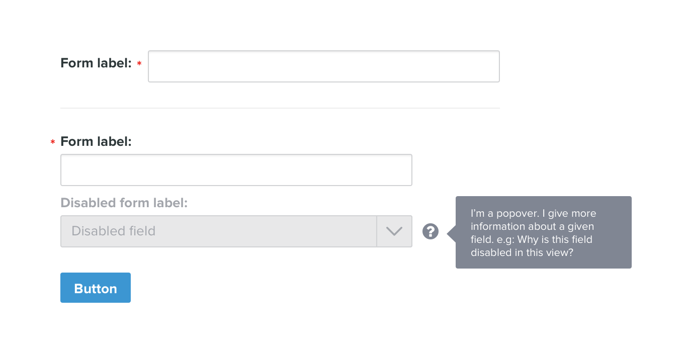
- Form label placement: The recommended label placement is to the left of the form field. The high-level rule is as follows:
- Place labels to the left of form fields:
- in all complex forms (like when the form is the core content of the page);
- in scenarios where vertical space is a major concern (like in modals).
- Place labels above form fields:
- in short, simple forms (like a log-in form; or a sign-up form in a landing page);
- Place labels to the left of form fields:
- Form action buttons:
- Use a 100% width line (divider) at the end of the form.
- In a full-page form the line must respect the padding of the layout. In modals the line should be full-bleed. That is, it extends to the edges of the modal.
- In forms with labels aligned to the left of the fields, visually align the action buttons to the input fields.
- In forms with labels aligned to the top of the fields, visually align the action buttons to the left edge of the form.
- When a form has more than one action, place the primary action to the right of any secondary action. e.g. "Cancel" first, then "Save".
Buttons
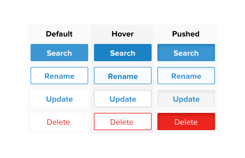
- Primary Buttons: High priority calls to action. They are the primary action the user can perform in a screen.
- Secondary Buttons: Medium priority calls to action. They're instrumental actions that complement the primary action of a screen.
- Chiclet Links: Links that appear flat by default and become button like on hover. They're low priority calls to actions. They are not the primary action users look to perform in a screen.
- High-Risk Links: Actions that have a deeper impact than the user may be aware of. Users often look to undo these, so consider a confirmation notification with an undo action.
Form Layout
This section will be updated with more details during Phase 2]
- Form title: Describes the form as a whole. If the form is the core content of the page, use an
h2tag, otherwise useh3and adjust the rest of the page hierarchy accordingly. A short paragraph of text can follow the form title to introduce the form. - Form group headline: Describes a group of related controls and fields within a form where users benefit from concentrating on them as a whole. Usually
h3. A short paragraph of text can follow the group headline to explain the group.
Form Language
- When writing form titles think of a short, clear description of what people can do by completing the form. A form implies people are going to take some action, so a good form title would start with an action word to emphasize that point. E.g.: If it's a form for creating a new campaign, the title should be “Create a new campaign”.
- Label inputs with clear names.
- Denote required fields with a clear mark.
- Label buttons with what they do. E.g.: Edit, Save, Remove.
Form Validation
- Client-side validation is prefered over validation that reloads the page.
- Place validation messages directly under the form field they talk about.
- Don't show a success message for all correctly filled-out form fields. Show success messages for hard questions like User ID or Password, where the user is most likely to input an invalid answer. But don't show success messages for simple questions like Name, Last Name, Email, etc.
Accessibility
This section will be updated with more details during Phase 2 [TODO: Section 508 accessibility compliance research].
- Auto focus the first field of the form by default. Users should then be able to tab through elements in the form in a logical sequence.
- Use appropriate tags in input labels so that the relevant input field is focused when the label is clicked. Same apply to check-boxes and radios.
What's Next?
1. Are you really done reading? If yes, read on. Otherwise, return to the top ↩
Good job! Thanks for reading. You should now go to the Pattern Library in Zeplin to find detailed design specs. Inspect Pattern Library in Zeplin »
Next Steps
The next step is to start building a reliable, modular codebase based on these design specs. We would then start replacing old elements with the new elements we have defined.
Examples
If we started updating specific screens of the app to use the new elements it would look something like this:
Dialoge Screen
| Before | After |
|---|---|
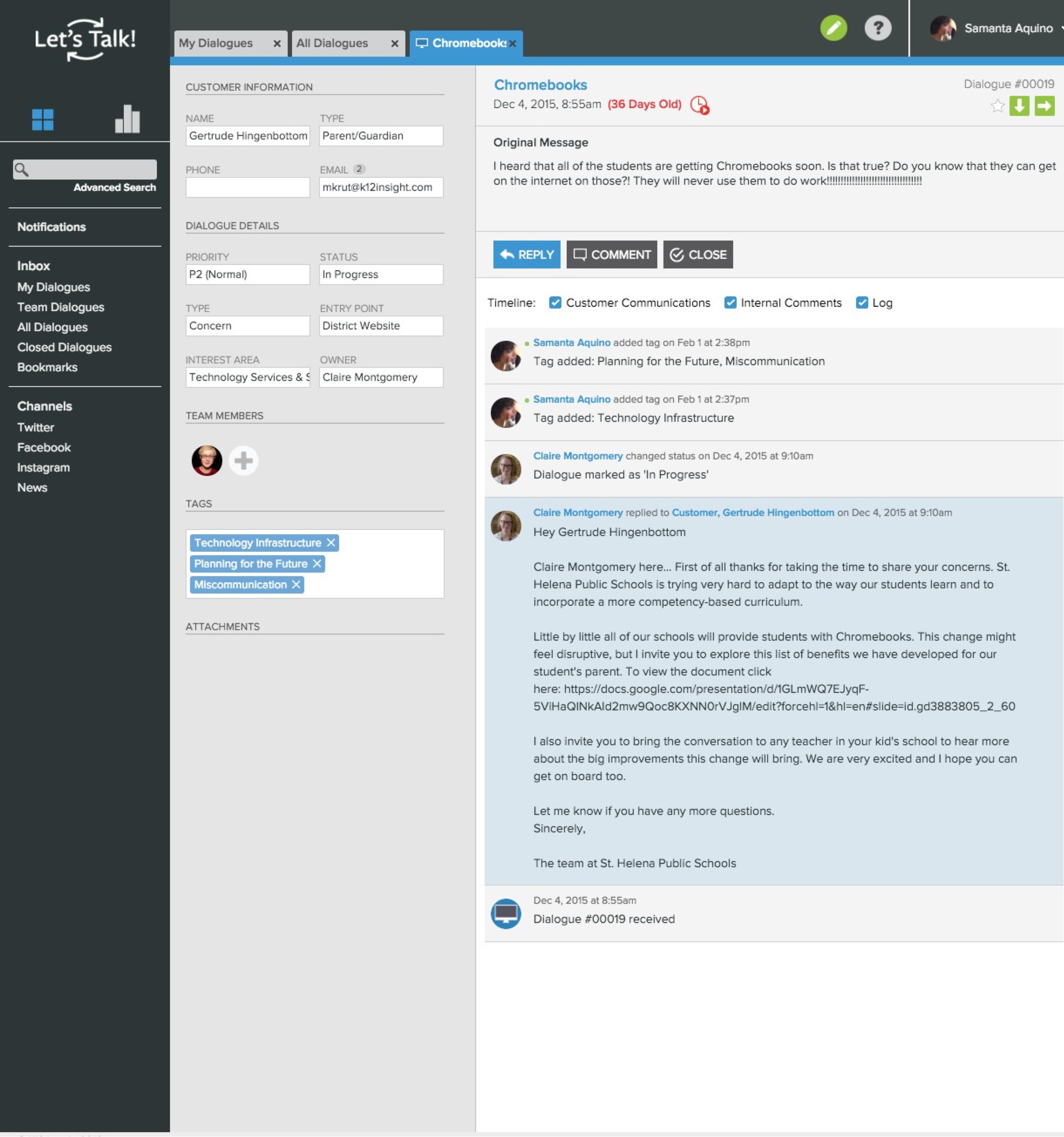 |
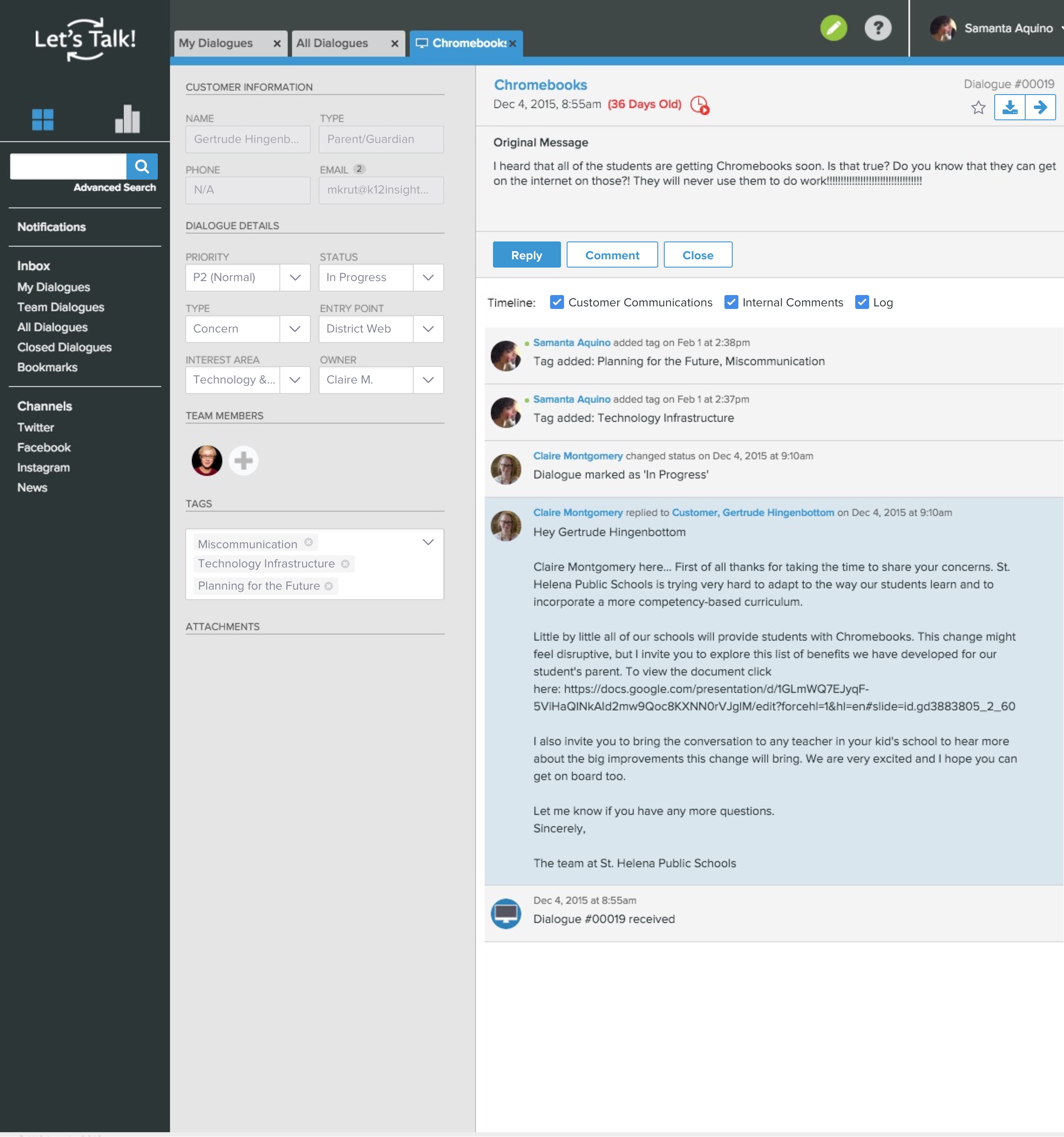 |
Edit User Modal
| Before | After |
|---|---|
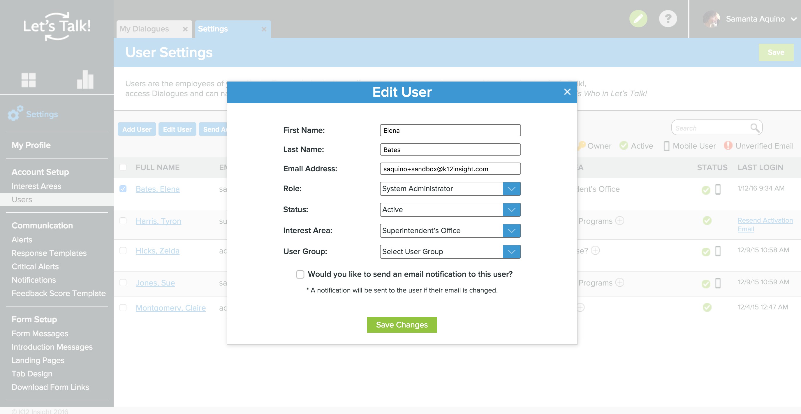 |
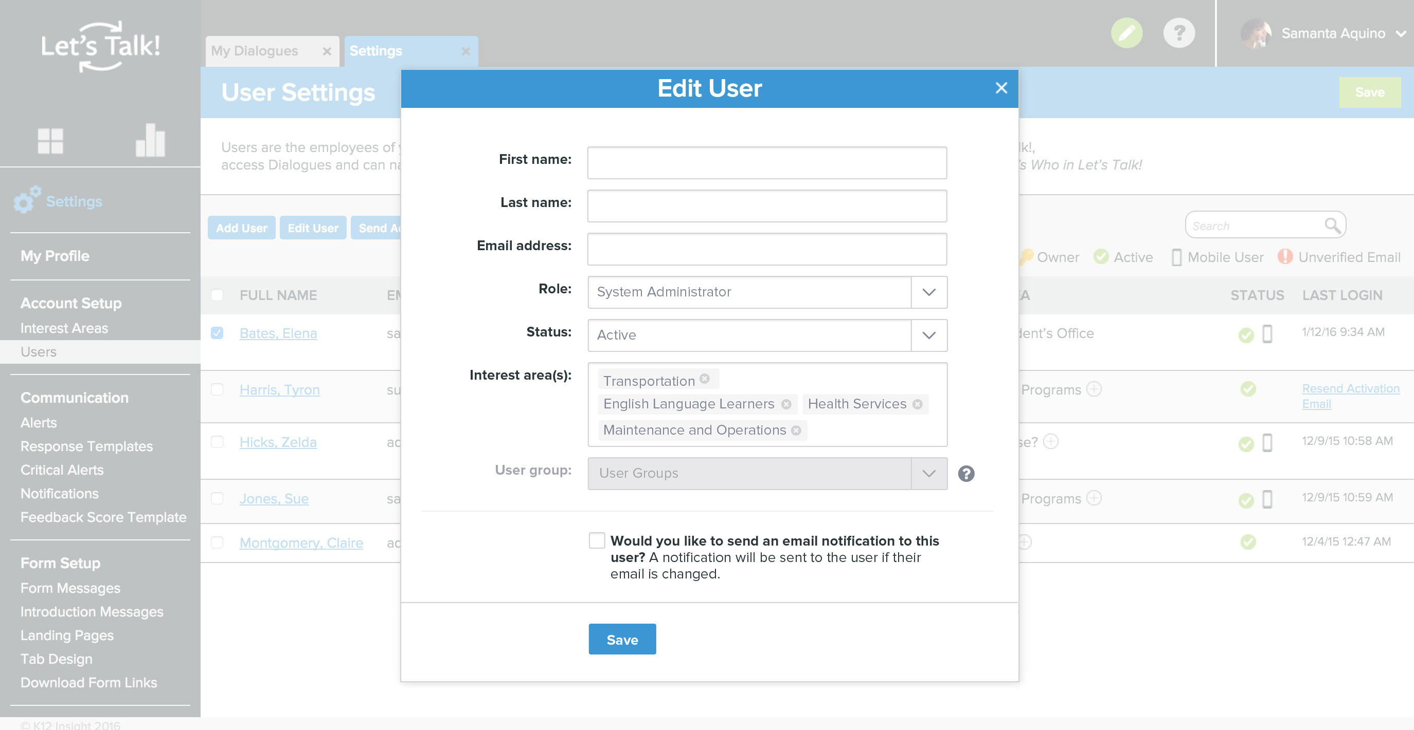 |